SVI and Health Outcome
SVI and COVID-19 hospitalizations in Philadelphia
Source:vignettes/articles/svi-covid.Rmd
svi-covid.RmdDesigned to represent the relative resilience of communities within an area, SVI not only provides valuable information for local officials/policymakers in planning and managing public health emergencies, but also offers an important neighborhood metric to facilitate public health research, such as the correlation between health outcome and SVI (and the socioeconomic/demographic factors involved) of a certain area.
For example, to investigate the possible correlation between the COVID-19-related deaths and SVI in Philadelphia at the ZCTA level, we could use findSVI to get ZCTA-level SVI for Philadelphia (with geometry) and join the result with ZCTA-level COVID-19 data for visualization and correlation analysis.
As usual, we start with loading all the packages needed.
ZCTA-level SVI in Philadelphia for 2020
For retrieving census data with geometry, we’ll use
get_census_data() and get_svi() to obtain SVI.
We’ll keep the GEOID(ZCTA) and SVI-related columns in the resulting SVI
table.
phl_zcta_2020_geo_data <- get_census_data(
  2020,
  geography = "zcta",
  state = "PA",
  county = "Philadelphia",
  geometry = TRUE
)

phl_zcta_2020_geo_svi <- get_svi(2020,
  data = phl_zcta_data_geo_2020) %>%
  select(GEOID, contains("RPL_theme"))

phl_zcta_2020_geo_svi
#> Simple feature collection with 48 features and 6 fields
#> Geometry type: MULTIPOLYGON
#> Dimension: XY
#> Bounding box: xmin: -75.28027 ymin: 39.84987 xmax: -74.95578 ymax: 40.13799
#> Geodetic CRS: NAD83
#> # A tibble: 48 × 7
#> GEOID RPL_theme1 RPL_theme2 RPL_theme3 RPL_theme4 RPL_themes
#> <chr> <dbl> <dbl> <dbl> <dbl> <dbl>
#> 1 19102 0.0444 0.0222 0.0889 0.956 0.178
#> 2 19103 0.0222 0.222 0.178 0.933 0.267
#> 3 19104 0.689 0.2 0.556 0.978 0.689
#> 4 19106 0 0.111 0.0444 0.711 0.0444
#> 5 19107 0.333 0.0667 0.4 1 0.378
#> 6 19109 NA NA NA NA NA
#> 7 19111 0.578 0.867 0.511 0.578 0.711
#> 8 19112 NA NA NA NA NA
#> 9 19114 0.178 0.422 0.156 0.111 0.2
#> 10 19115 0.378 0.822 0.289 0.822 0.533
#> # ℹ 38 more rows
#> # ℹ 1 more variable: geometry <MULTIPOLYGON [°]>ZCTA-level COVID-19 data in Philadelphia
Disease-related data at the ZCTA level is usually not easily accessible for privacy reasons. Here, we’ll use data from the COVID-19 Health Inequities in Cities Dashboard, a great resource released by Drexel University’s Urban Health Collaborative and the Big Cities Health Coalition (BCHC). In addition to data available for download, the dashboard provides informative visualizations of COVID-19 related outcomes and inequities over time and across BCHC cities.
After downloading the raw data, we can select Philadelphia city and the variables of interest (hospitalization per 100k).
#source:https://github.com/Drexel-UHC/covid_inequities_project
#bchc_raw <- read_csv("../../byZCTA_bchc.csv")

phl_hosp <- bchc_raw %>%
  filter(city == "Philadelphia") %>%
  mutate(GEOID = paste(zcta), .after = zcta) %>%
  select(GEOID, hosp_per_100k)

glimpse(phl_hosp)
#> Rows: 46
#> Columns: 2
#> $ GEOID <chr> "19102", "19103", "19104", "19106", "19107", "19111", "1…
#> $ hosp_per_100k <dbl> 194.288, 846.618, 1280.807, 405.019, 1555.831, 1133.411,…Joining data for visualzation
Once we have the ZCTA-level SVI and COVID-19 data ready, we can join them together by GEOID(ZCTA), keeping the spatial information.
phl_svi_covid <- phl_hosp %>%
  left_join(phl_zcta_2020_geo_svi, by = "GEOID") %>%
  #although geometry sticky, after wrangling, class() become df
  st_as_sf(sf_column_name = "geometry")

phl_svi_covid %>%
  select(GEOID, NAME, hosp_per_100k, RPL_themes, geometry) %>%
  head(10)
#> Simple feature collection with 10 features and 4 fields
#> Geometry type: MULTIPOLYGON
#> Dimension:     XY
#> Bounding box:  xmin: -75.24074 ymin: 39.92578 xmax: -74.97371 ymax: 40.13799
#> Geodetic CRS:  NAD83
#> # A tibble: 10 × 5
#>    GEOID NAME        hosp_per_100k RPL_themes                           geometry
#>    <chr> <chr>               <dbl>      <dbl>                 <MULTIPOLYGON [°]>
#>  1 19102 ZCTA5 19102          194.     0.178  (((-75.16854 39.94663, -75.16845 …
#>  2 19103 ZCTA5 19103          847.     0.267  (((-75.18166 39.95151, -75.18091 …
#>  3 19104 ZCTA5 19104         1281.     0.689  (((-75.21367 39.96003, -75.21204 …
#>  4 19106 ZCTA5 19106          405.     0.0444 (((-75.15476 39.94573, -75.15449 …
#>  5 19107 ZCTA5 19107         1556.     0.378  (((-75.16506 39.95361, -75.16332 …
#>  6 19111 ZCTA5 19111         1133.     0.711  (((-75.10653 40.04938, -75.10457 …
#>  7 19114 ZCTA5 19114         1336.     0.2    (((-75.03509 40.07462, -75.03081 …
#>  8 19115 ZCTA5 19115         1502.     0.533  (((-75.07456 40.08912, -75.07127 …
#>  9 19116 ZCTA5 19116         1226.     0.489  (((-75.04426 40.11571, -75.04386 …
#> 10 19118 ZCTA5 19118         1038.     0.133  (((-75.24022 40.0836, -75.23895 4…
Maps
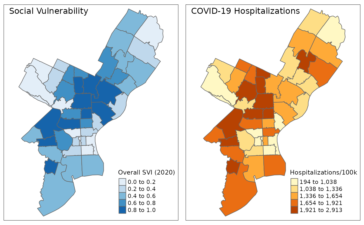
To visualize their spatial pattern directly, we can plot the SVI and COVID-19 data in Philadelphia neighborhoods (ZCTAs) directly on maps:
plot_data <- phl_svi_covid %>%
  select(GEOID, geometry, RPL_themes, hosp_per_100k) %>%
  drop_na()

# function for map
plot_phl <- function(data, var){
  ggplot(data)+
    geom_sf(aes(fill=cut({{var}},
      breaks = quantile({{var}}, probs = seq(0, 1, 0.2)), dig.lab = 4, include.lowest = TRUE)),
      size = 0.1)+
    coord_sf(crs = st_crs(26915))+
    theme_minimal()+
    theme(
      legend.title = element_text(size = 10),
      axis.text = element_blank(),
      panel.grid = element_blank(),
      legend.position = "inside",
      legend.position.inside = c(0.8, 0.03),
      legend.text = element_text(size = 9),
      legend.key.size = unit(0.4, "cm"),
      plot.background = element_rect(color = "black", fill=NA, linewidth = 0.1),
      plot.margin = unit(c(0, 0.5, 1, 0.5), "cm")
    )
}

# assemble plots
svi <- plot_phl(plot_data, RPL_themes)+
  scale_fill_brewer(
    name = "Overall SVI (2020)",
    labels = c("0.0 - 0.2", "0.2 - 0.4", "0.4 - 0.6", "0.6 - 0.8", "0.8 - 1.0"),
    palette = "Blues"
  )+
  labs(title = "Social Vulnerability")+
  theme(plot.title = element_text(size = 13, hjust = -0.1, vjust = -0.1))

covid_hosp <- plot_phl(plot_data, hosp_per_100k)+
  scale_fill_brewer(
    name = "Hospitalizations/100k",
    labels = c("194 - 1,038", "1,038 - 1,336", "1,336 - 1,654", "1,654 - 1,921", "1,921 - 2,913"),
    palette = "YlOrBr"
  )+
  labs(title = "COVID-19 Hospitalizations")+
  theme(plot.title = element_text(size = 13, hjust = -0.2, vjust = -0.1))

maps <- plot_grid(svi, covid_hosp)

title <- ggdraw() +
  draw_label(
    "SVI and COVID-19 hospitalizations in Philadelphia Neighborhoods",
    fontface = 'bold',
    size = 14,
    x = 0,
    hjust = 0
  ) +
  theme(plot.margin = margin(0, 0, 0, 7))

caption <- ggdraw()+
  draw_label(
    "COVID-19 data are cumulative till 8/2022",
    size = 9,
    x = 0.6,
    hjust = 0)+
  theme(plot.margin = margin(0, 7, 0, 0))

plot_grid(
  title, maps, caption,
  ncol = 1,
  rel_heights = c(0.1, 1, 0.05)
)
Correlation
To look at possible correlation between SVI and COVID-19 hospitalizations, we’ll use scatter plot to visualize their relationships:
phl_svi_covid %>%
  ggplot(aes(x = RPL_themes, y = hosp_per_100k)) +
  geom_point()+
  labs(
    title = "Social Vulnerability and COVID-19 Hospitalizations \nin Philadelphia Neighborhoods",
    caption = "COVID-19 data are cumulative till 8/2022",
    x = "Overall SVI (2020)",
    y = "Hospitalizations per 100k") +
  theme_bw()+
  theme(
    text = element_text(size = 13),
    plot.title = element_text(size = 14, face = "bold"),
    axis.title = element_text(size = 12, face = "bold"),
    legend.title = element_text(size = 13),
    plot.caption = element_text(size = 9, color = "#4D4948")
  )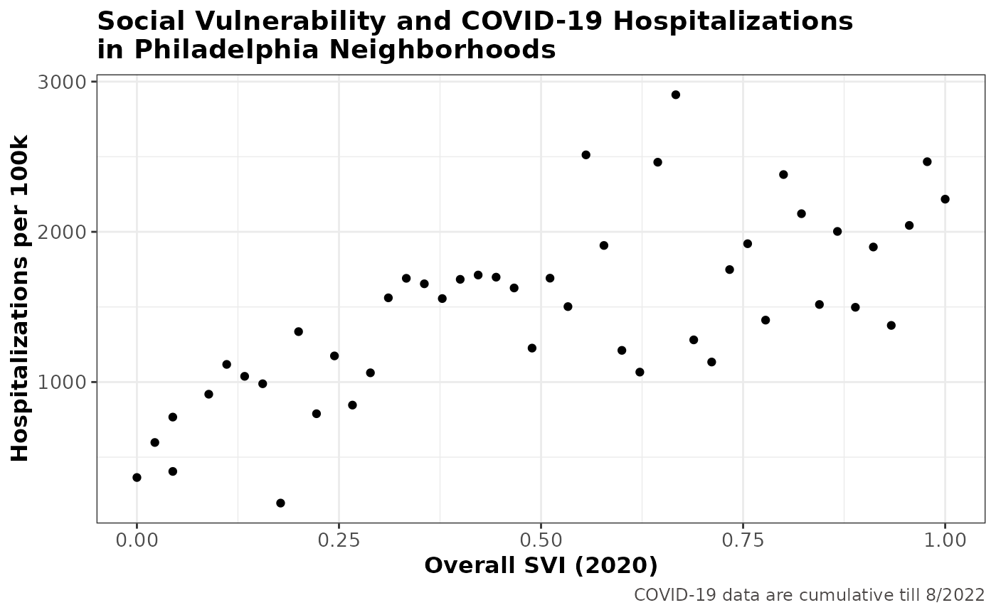
With a correlation coefficient of 0.7030584, overall SVI is shown to be strongly associated with COVID-19 hospitalizations in Philadelphia neighborhoods, where higher hospitalization rate is found in neighborhoods with higher social vulnerability.
This is consistent with the story on the COVID-19 Health Inequities in Cities Dashboard, where they found most socially vulnerable neighborhoods have 129.4% higher hospitalizations per 100k compared to the least socially vulnerable neighborhoods.
Reference
Diez Roux, A., Kolker, J., Barber, S., Bilal, U., Mullachery, P., Schnake-Mahl, A., McCulley, E., Vaidya, V., Ran, L., Rollins, H., Furukawa, A., Koh, C., Sharaf, A., Dureja, K. (2021). COVID-19 Health Inequities In Cities Dashboard. Drexel University: Urban Health Collaborative. http://www.covid-inequities.info/.